Hello! Looking for info on how to color code the stacked bar chart (pic included) by indirect activity for each user. The supervisors want to see each user’s total indirect hours throughout shift with the activity detail stacked.
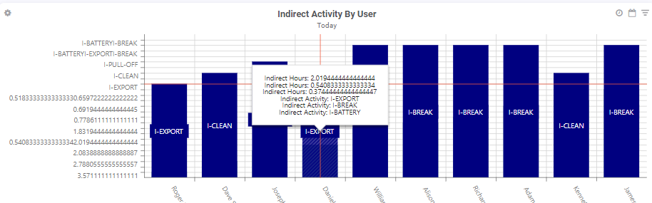
Hello! Looking for info on how to color code the stacked bar chart (pic included) by indirect activity for each user. The supervisors want to see each user’s total indirect hours throughout shift with the activity detail stacked.
Hello,
Usually for stacked bars each series is by default displayed in a different color. Can you tell me more about how your widget is built? You can access information about the Series, the commonSeriesSettings as well as the seriesTemplate through the chart properties pane in the Widget Builder.
Thank you!
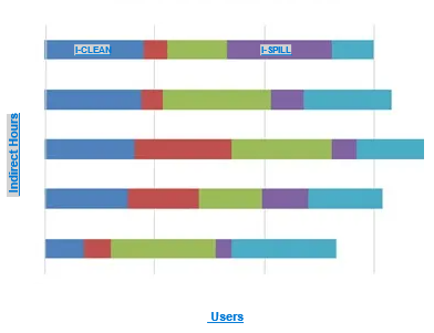
I tried adding another series for the indirect activity name but it didn’t color code the different activities. I’d like to get the chart to look something like this (hours and users flipped):
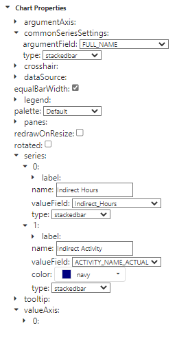
Here is a snapshot of the current chart properties:
Hello again,
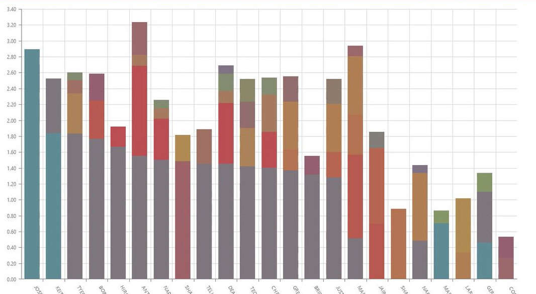
Thank you for the clarifications. If I understand correctly, you want to display a stackedbar chart that is color coded according to each indirect activity, quantified by indirect hours. So your chart would look like this:
To achieve this:
Open your widget in the Widget Builder and navigate to the chart properties panel.
In the CommonSeriesSettings property, click on the ‘+’ button and add the valueField property. Select ‘Indirect Hours’. Keep the argumentField and type like you have them currently. ![]()
Click on the ‘+’ icon at the very top of the panel and add the SeriesTemplate property. In the name field property, enter ‘ACTIVITY_NAME_ACTUAL’. ![]()
You should see a chart similar to the one I added. Because we are using seriesTemplate, you can go ahead and remove the series as they are not used anymore.
Let me know if this works for you!
Awesome!! yes this worked, thank you!!